Key ideas
The ideas behind the work.
What nonclusive design is, where it comes from, and how to use it to read the designs around you. If you are new here, start with Universal Design, the field the rest grows from. Each idea also stands on its own.
01
Universal Design
The field I work in. Design that starts from human variation instead of adding accommodations afterwards.
Universal Design is the field I have spent my professional life in. The term was coined in 1985 by Ron Mace, an American architect and wheelchair user, and his argument was a practical one. Design done well from the start serves far more people than design patched afterwards with special solutions. The curb cut is the classic example. Wheelchair users fought for it, and it now serves parents with strollers, cyclists, delivery workers, travellers with luggage. In 1997 the Center for Universal Design condensed the field into seven principles that designers and policy makers still use as a working vocabulary, and other frameworks have been added since.
Universal Design is often treated as another word for legal accessibility. The two are related but not the same, and the difference matters in practice. In a 2025 paper with Agneta Ståhl and Susanne Iwarsson, I argue that three concepts need to be kept distinct and in relation to each other:
- Accessibility asks to what extent a person can access, understand and use it. It is mainly objective and measurable, and it is the layer building codes, WCAG and the European Accessibility Act work on.
- Usability asks how well it works for this person in this situation. It is subjective. A building can meet every code and still be hard to use.
- Universal Design asks whether this was designed from the start for human diversity, or whether variation is managed as an exception. It is the value-based vision and approach to design.
Accessibility is necessary but not sufficient. Usability builds on it. Universal Design is the vision behind both, with human variation as the premise of the design.
Three generations
The field has moved in generations. The first, from Mace onwards, gave us the term, the principles and the compliance instruments. The second brought in usability and process. How things are experienced, and who takes part in designing them. My own challenge to the field started in my 2009 thesis, whose chapter on the seven principles examined the body they presuppose. In 2022, my colleagues and I proposed a third generation, nonclusion. It does not begin by sorting people into those who fit and those who must be accommodated, since that sorting is what produces the gap the field has been trying to close.
Nonclusion is not a rejection of Universal Design. It is a contribution to the field and to where I think it is heading, and most of this site is about what that looks like in practice. If Universal Design is new to you, the three guidelines under How-to are a concrete place to start. If you want the research, Writing collects the publications behind everything summarised here.
02
Nonclusion
Design that starts from the fact that everyone already belongs.
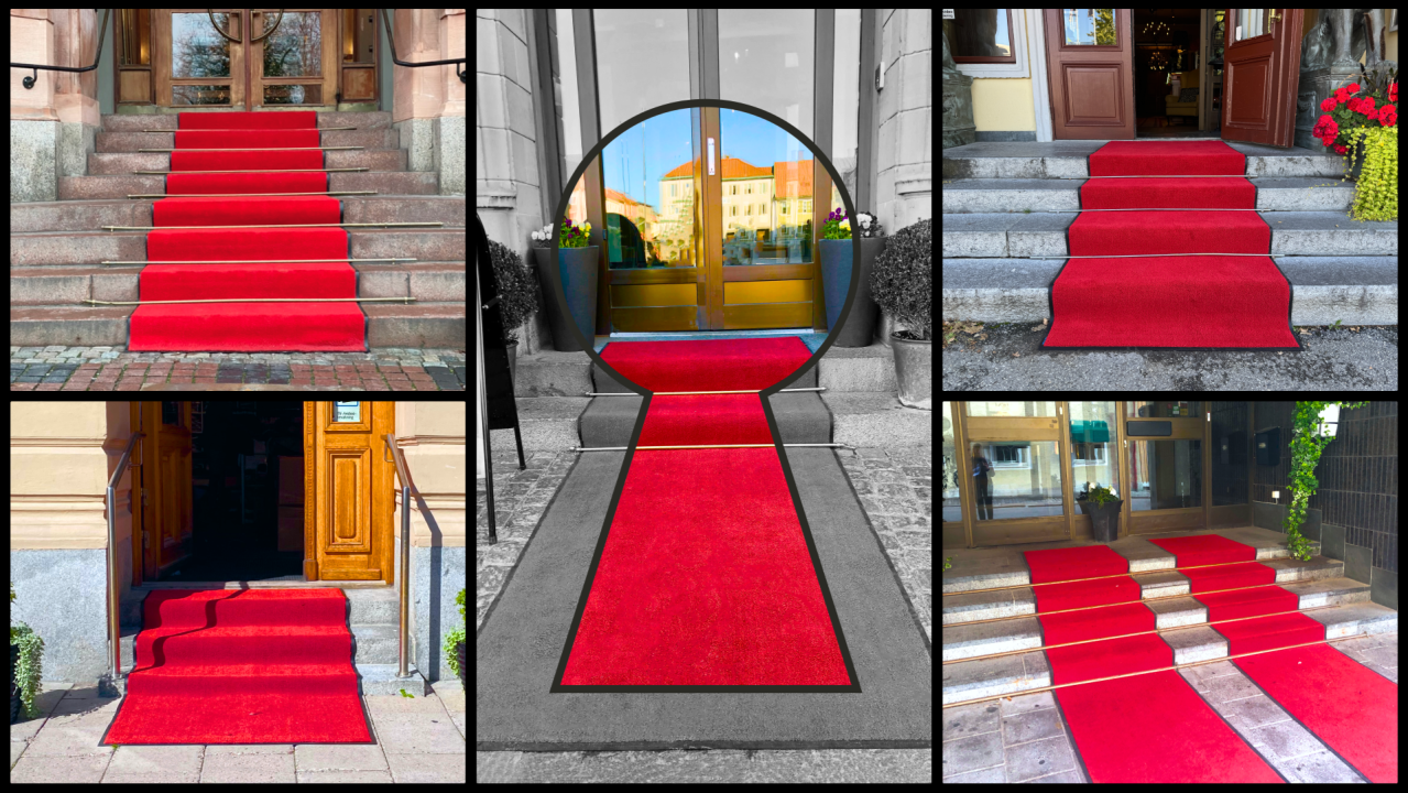
Nonclusion is the word my colleagues and I started using for design that does not begin by drawing a line between people who fit (the norm) and people who must be accommodated (the deviation). It starts somewhere else, with human variation as the premise of design rather than as an exception to manage.
Both inclusion and exclusion share a Latin root, claudere, meaning to close, to shut, to block. Inclusion still requires an outside. Someone is being brought in, someone holds the keys. Nonclusion is the move that does not put the boundary there in the first place, neither to shut people out nor to shut them in.
This is not inclusion done better. It does not accept that inclusion is the question to ask. What I call the nonclusive flip follows from this. Design does not need to grant belonging, it needs to stop denying it. Belonging is not a future state for the system to provide. It is already true of the person standing there. What design can do is recognise it.
The human-rights texts already speak this way, and dignity is where it is easiest to see. The Universal Declaration of Human Rights says people are born free and equal in dignity. The Convention on the Rights of Persons with Disabilities pairs dignity with respect, promote, protect and violate. Neither text ever says create, grant or give. Dignity is treated as something already there, to be recognised or denied but never handed out. That is what nonclusion says about belonging. Design can protect and support a person’s dignity. It cannot create it.
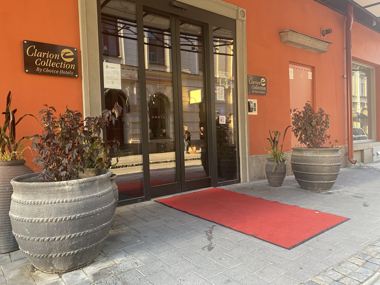
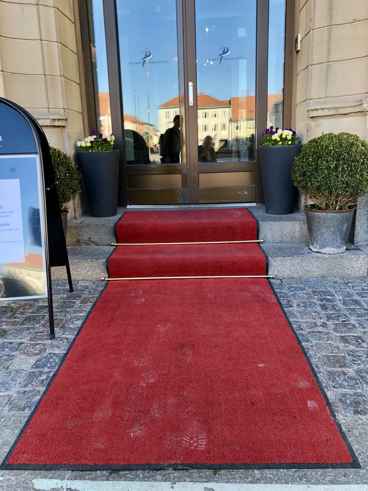
A hotel entrance with a red carpet leading straight up a flight of stairs is a welcome with a condition attached. The carpet says you belong, the stairs decide who gets in. A nonclusive entrance has one arrival for everyone, no marked alternative route, no symbol that says this way for you. The work is not to add a ramp beside the stairs but to design so that the question of a separate route does not come up.
The shifts
In the 2022 paper we named seven shifts that together describe the movement towards nonclusive design. An eighth, from person to situation, has grown since then, out of our language research and out of the situation argument in my licentiate and doctoral theses. Together they describe the direction, and you can look for them in any single design or sentence.
- From included to undefined users. When the design stops naming who it is for. Whoever arrives is who it is for.
- From person to function. When signs and controls show what a thing does or contains, and stop depicting who is expected to use it.
- From person to situation. When texts and designs address what is going on, so they cover everyone who is in the situation.
- From adaptism to variation. When the “normal” solution with a special adaptation on the side gives way to one solution that carries the variation itself.
- From separation to convergence. When separate routes and separate cases give way to shared ones.
- From reactive to proactive. When access is part of the design from the first drawing, so nothing has to be added when a particular person arrives.
- From unaware to aware. When the categorisations a design makes are made consciously, so they can be questioned and changed.
- From explicit to tacit. When the support is embedded in the design and works without announcing itself.
The three guidelines under How-to show these shifts in real things. Every move there ends with the shift it contributes to.
03
Categorisation
How the sorting of people shapes (and limits) what gets designed.
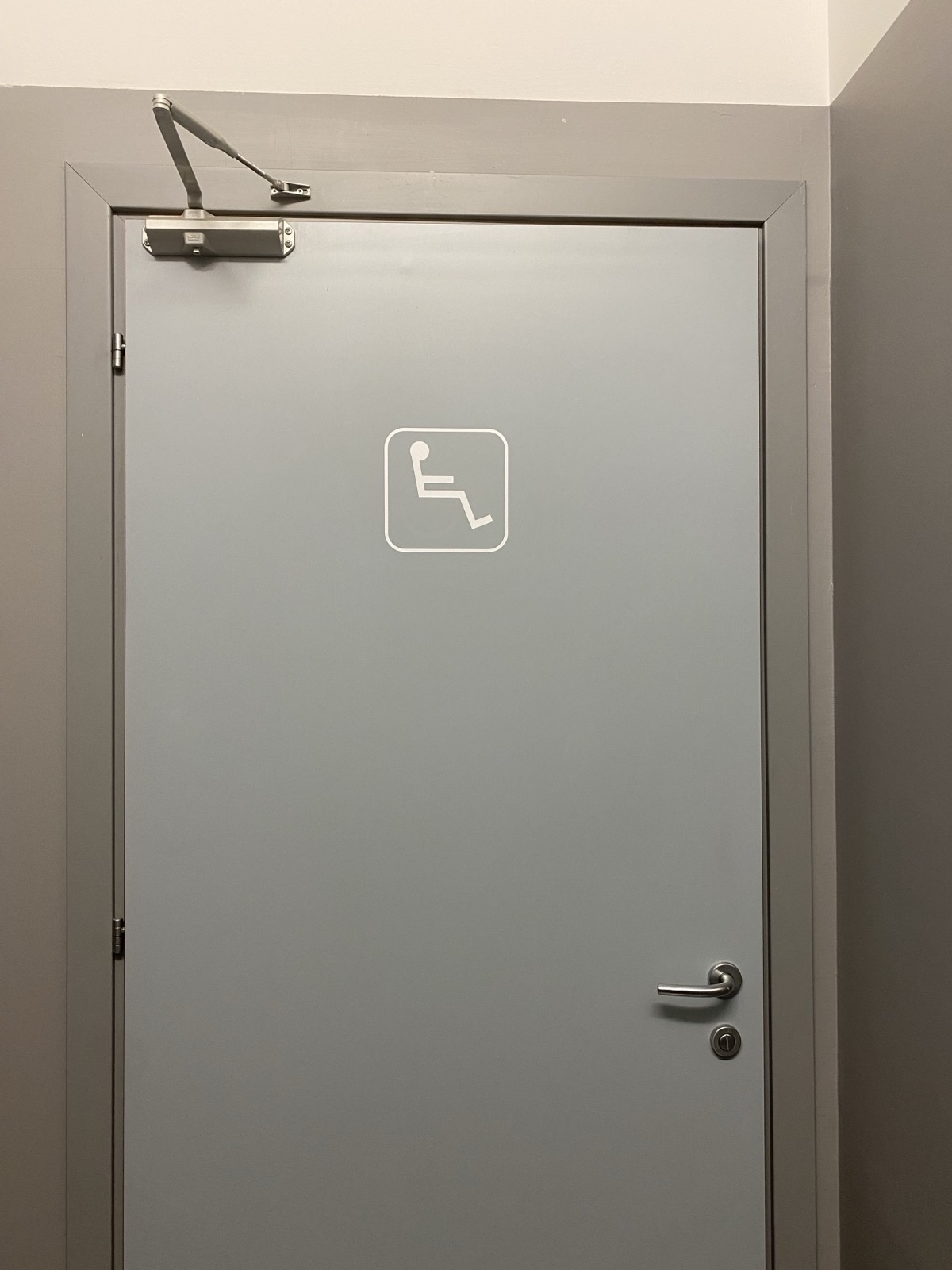
The first of what I call my three breakthroughs was seeing the key role categorisation plays in design. By breakthrough I mean something I notice in hindsight: a point where major learning happened, the kind that changes what you do because of what it lets you see. Categorisation was the tool that unlocked it, bottom-up, a key or a screwdriver, working from the environments, the signs and the sentences up to the pattern.
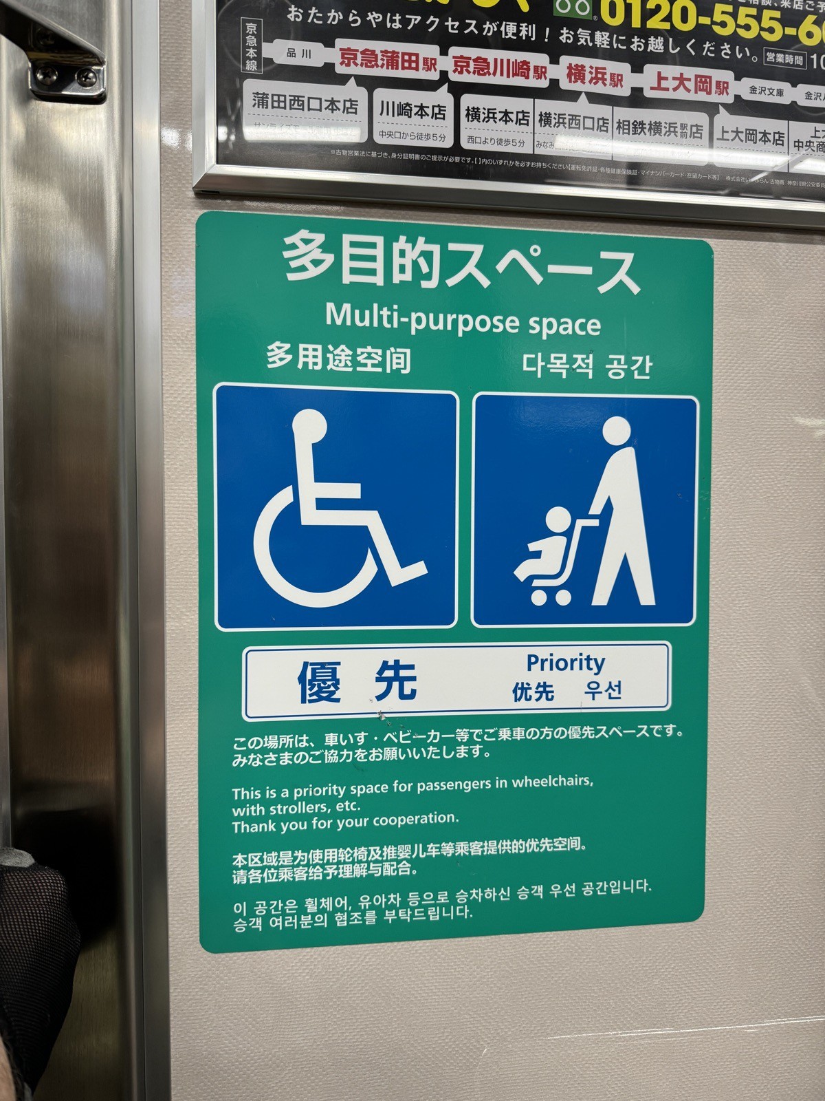
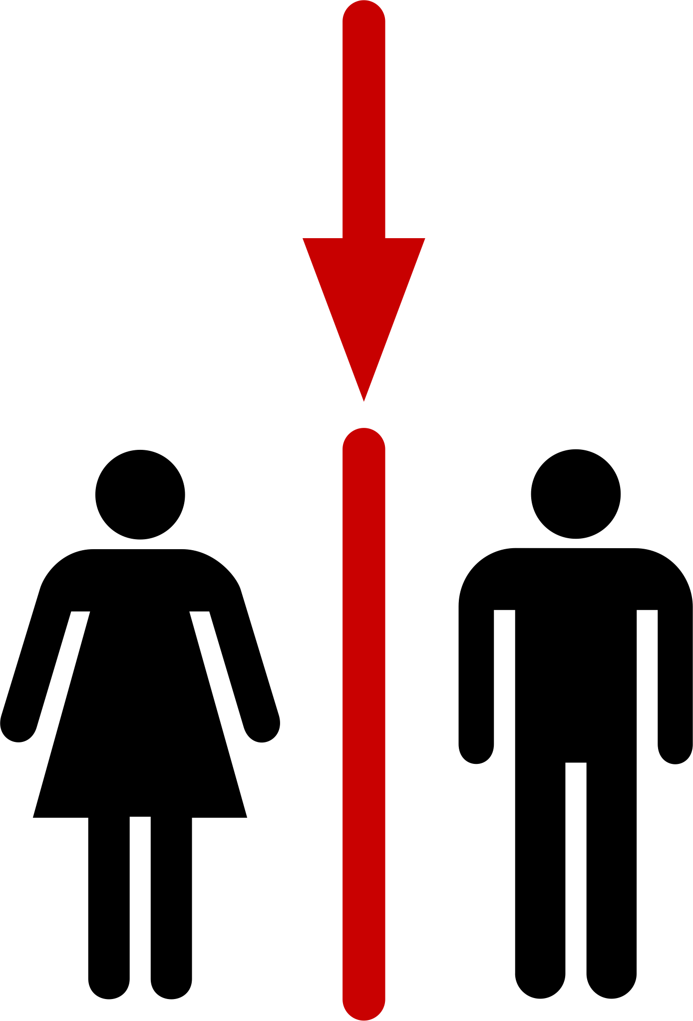
Most accessibility work, including most Universal Design work, assumes that categorisation is a neutral instrument. A wheelchair symbol categorises a space as accessible. A “persons with disabilities” clause in legislation categorises a population the law will protect. A toilet sign categorises bodies. The acts are done in good faith, presented as descriptive, as protective, as inclusive.
The breakthrough was seeing that they are none of those things. Categorisation is an act, not a description. It is always done to someone by someone. Every act of sorting bodies into types reproduces a norm. Categorisation cannot help us understand accessibility, because categorisation is what produces the gap between the taken-for-granted user and the accommodated other in the first place. The wheelchair sign names a body, and that naming is the problem.
Nonclusion is the response to this. In the hundreds of wheelchair signs, toilet signs and accessible-entrance arrangements I have photographed in many countries, the same norm-and-deviation structure recurs. It returns in very different materials: six modes of wheelchair signs, the EAA’s “persons with disabilities” formula, the CRPD’s “on an equal basis with others”, EN 17161’s user categories. That is how I came to see the mechanism. If categorisation were only a description, the same structure would not keep returning.
The way forward follows from the problem. If categorising persons is what produces the gap, the practical move is to change what gets described, from person to function and from person to situation. A sign that shows the toilet instead of a body. “Step-free access” instead of a person in a wheelchair. In our work with municipalities, this has been the easiest nonclusive move for people to pick up and apply in their own contexts.
04
“Us” and “them”
A way to see whether a design divides people or refrains from it.
The “us” and “them” lens is how I read designs, whether photographs, texts, signs or architectural decisions. It asks one question in different forms: does this design or design act produce, sustain or resist a division between “us” and “them”?
The lens grew out of noticing the key role categorisation plays in design. Once I could read a wheelchair sign as an act of categorisation, naming a deviation from an assumed norm rather than just showing the way, the same reading worked for toilet signs, policy texts, accessible-entrance routing and standards. The categorisation was the same. Only the material changed.
The lens has eight mechanisms, and the main one is norm and deviation. The lens shows what “us” and “them” looks like. Nonclusion is design without it.
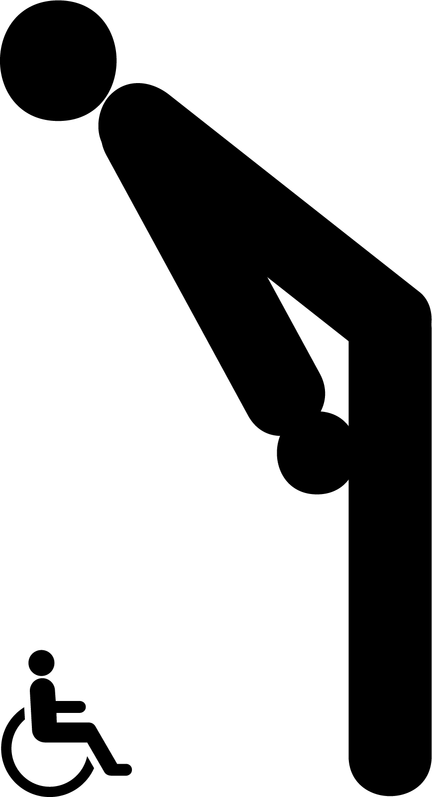
A wheelchair symbol on a side entrance does seven of the eight mechanisms at once. It marks a body type. It routes a conditional access path. It locates a physical separation. It applies a label. It makes the unmarked main entrance the default for “everyone.” It relies on the language of “persons with disabilities.” And the absence of any symbol on the main entrance is in itself a categorisation.
05
Benchmarking Universal Design
What it would take to measure Universal Design.
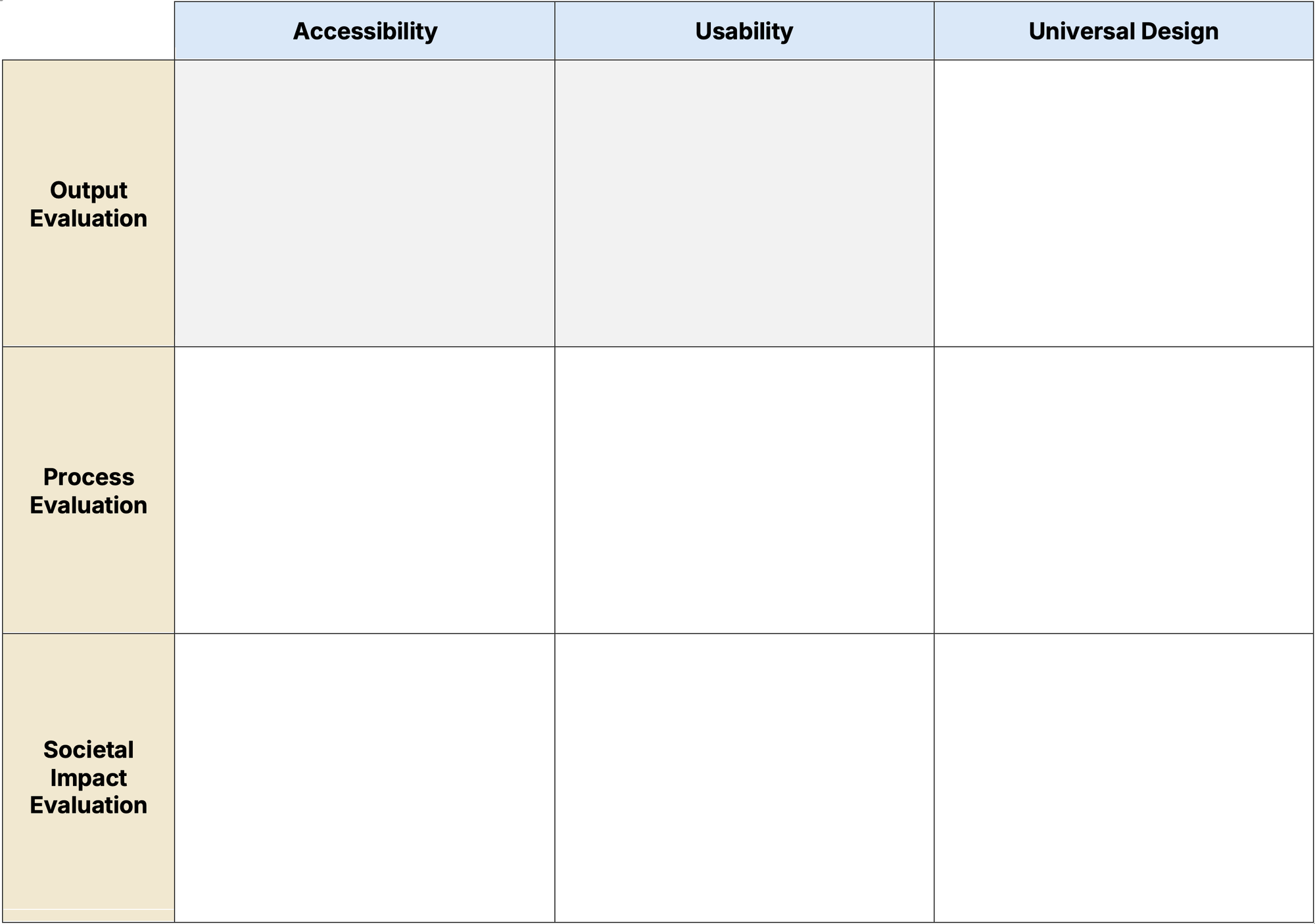
What would it mean to benchmark Universal Design at the societal level? It is a different question from the familiar one about accessibility.
Accessibility benchmarking measures whether the floor is high enough. Does a website meet WCAG, a service the EAA, a city the ADA? Most existing UD evaluation frameworks operate at the project or organisational scale, not at the societal one. Measurement at the scale of society is largely missing, and where it is attempted it is often accessibility compliance under another name, measuring outputs rather than conditions.
Newsletter 15 proposed an analogy. Measure UD the way we measure peace. The Positive Peace Index measures conditions for flourishing, such as well-functioning government, low corruption, equitable distribution of resources and free flow of information, rather than counting weapons or the absence of war. The eight pillars are not peace themselves, they are conditions in which peace is possible. UD at the societal scale could be measured the same way, by tracking the conditions for human variation to flourish rather than the presence or absence of specific barriers.
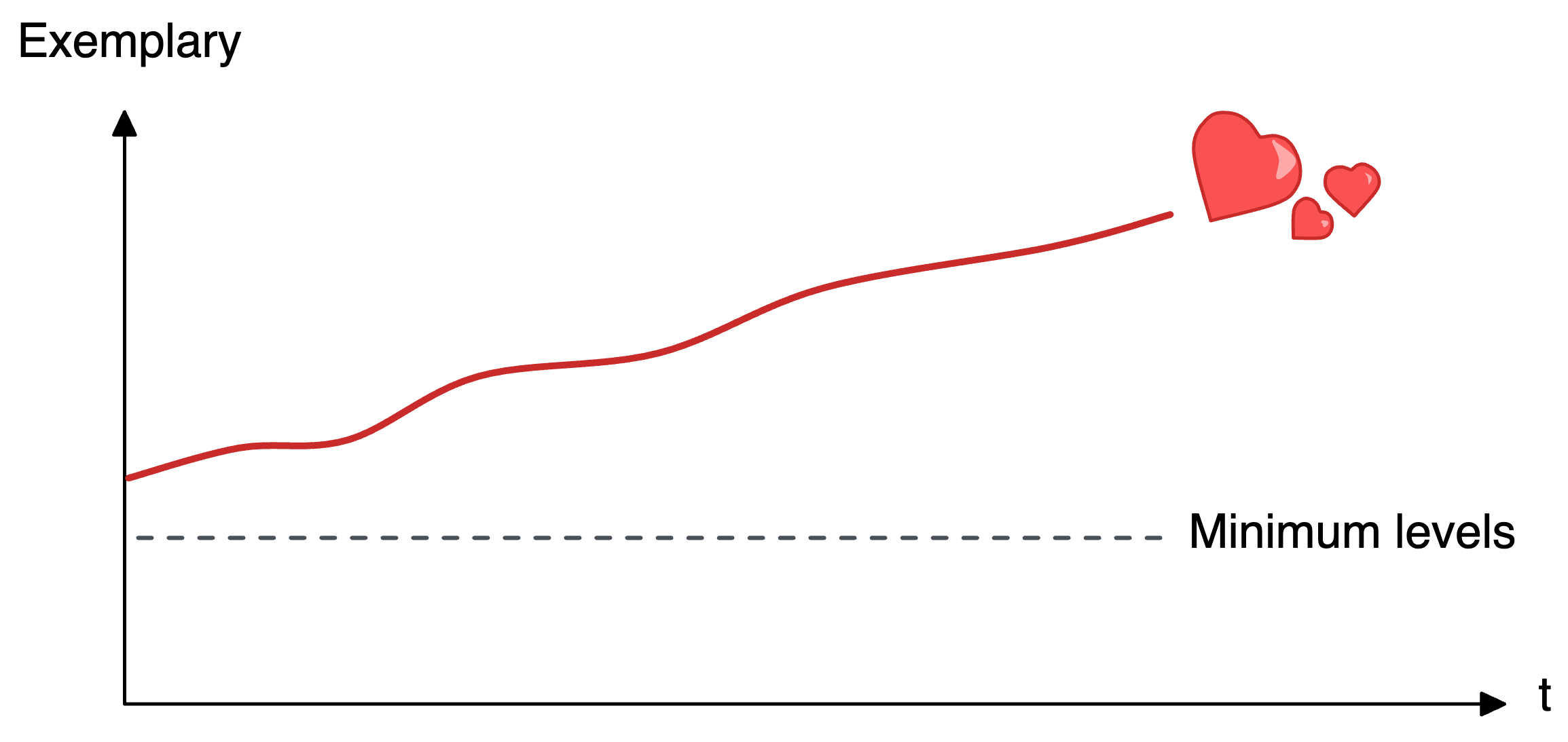
One more distinction matters here. Compliance and exemplarity are different columns of the matrix, not different amounts on one scale. A design can meet every requirement and never become exemplary, and much of what is exemplary is unregulated. Moving from one to the other is a move between columns, not a higher score. I have drawn this distinction as the exemplary curve, one of the open resources.
The 3×3 matrix, with Accessibility, Usability and UD on one axis and Output, Process and Societal Impact on the other, is what organises the discussion. After the first pilot tests with participants from municipalities and other researchers, the richest cell turned out to be UD × Societal Impact. Process × Usability is where people’s lived, subjective experience enters the process and changes it.
The matrix also turns out to have a longer history than I knew. My 2009 thesis wrote that the experience of each activity “leaves its imprint, both on the individual and on the surrounding culture”, and the Societal Impact row evaluates that imprint on culture: the growth of accessibility in society, and the values Universal Design contributes to. As a wheelchair user, a sole focus on accessibility compliance has always felt incomplete. I didn’t know it back then, but now I can see some of where the benchmarking matrix came from.
The newsletter edition has since grown into a full paper, Benchmarking Accessibility, Usability, and Universal Design – What Kind of Society Are We Building?, written with Lilian Müller, Larry McNutt and Gerald Craddock and accepted for UD26, the 8th International Universal Design Conference, in Galway in November 2026. A workshop at the same conference goes with it, What Makes Universal Design Visible? Direct and Proxy Indicators, where Lilian Müller and I ask the participants to generate indicators for the cells of the matrix. The paper is published after the conference, and I will add it to my papers then. The indicators the workshop produces go on into Provtryck Konsekvenserna!, where the matrix is tested in Gothenburg’s digital twin.

Over to you
These ideas grew in dialogue, with colleagues, students, and newsletter readers who push back and send me what they notice. If one of them changes how you read a design around you, I would love to hear about it. Write to me at hello@peohedvall.com, or in the comments on the newsletter.