Meet variation with variation
Human variation is the starting point, not a problem to manage. Answer it with variation in the designed world: forms, heights, routes, and provisions that already contain the difference.
These are places to begin designing from, not standards to audit against. Every example below exists, photographed or quoted as I found it. Each move names a design act or a text act, something you do as you build or write, which then often shows in the result.
Vary the form, not the user
Design move
Build the variation into the form itself, so that no user has to be the exception. When the form varies, everyone finds their place without being given one.
What it resists: the standard table with one adapted end, where the design decides your place for you.
The round table with gaps — playground, Sweden
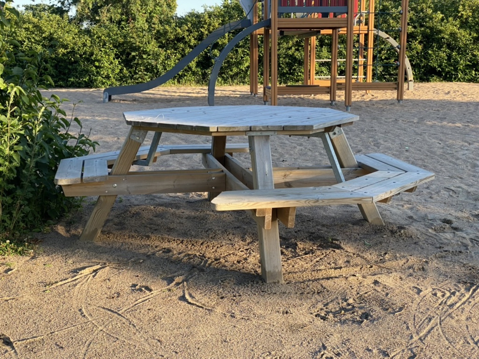
A round picnic table with cutout gaps between the bench sections. Anyone can pull up: a wheelchair, a stroller, someone who prefers to stand. The round form means everyone sits together. There is no designated place, because every place is the designated place. This way, the table meets human variation with seating variation. Table by KPLN Design AB.
The extended tabletop — new-built square, Sweden
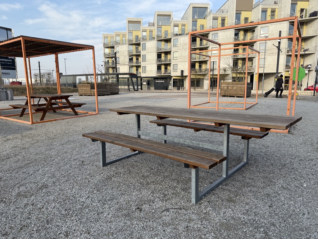
A straight picnic table where the top simply runs on past the benches, leaving a free open edge. Nothing is marked and nothing is added on: the open end is just table, ready for a wheelchair, a pram, or a chair pulled up from elsewhere. The same move as the round table, carried out in a rectangle.
The table whose seating varies — Kalmar, Sweden
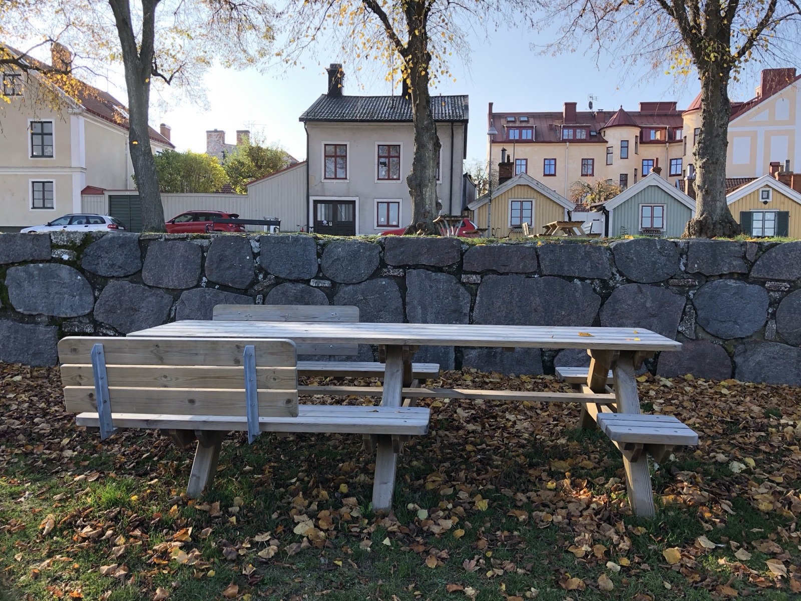
One long table whose seating already varies: sections with backrests, sections without, and two places near the middle where no seat was built, facing each other. Even the backrests stop before their benches do, so the same seat offers sitting with and without support. Sit with back support, sit without, or roll in and sit face to face with someone, inside the group rather than at its end. No place is set aside for anyone. Table by KPLN Design AB.
Text size, contrast and dark mode — every smartphone
Every phone ships with text size, contrast and dark mode as ordinary settings, and everyone uses them: larger text with the morning paper, dark mode at night, higher contrast in the sun. The form varies, and no user has to be the exception. Here the digital has an advantage: a bench has one shape at a time, but an interface can have many, one for each reader. Changing a bench means rebuilding it. Changing an interface means changing a setting.
Contributes to the shift from adaptism to variation. When the form itself varies, nobody needs a special adapted version added on later.
Equal at every height
Design move
Where reach differs, repeat the full function at another height. Never a lesser version at the lower or higher position: the same thing, within everyone’s reach.
What it resists: the lowered counter that gives you a surface but no machine, and the sign that says “please ask staff for assistance”, where using the room depends on someone else being available.
The coffee station with two full setups — institutional interior, Sweden
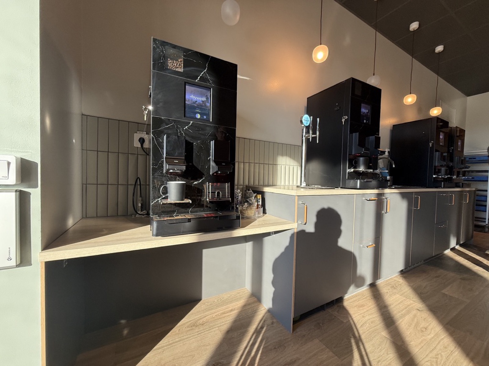
Two counter heights, and each has its own complete coffee machine. The lower counter is not a serving hatch for the upper one. You make your own coffee at whichever height suits you today. Same coffee, same independence, no asking.
The foot-height buttons — Handicaporganisationernes Hus, Taastrup
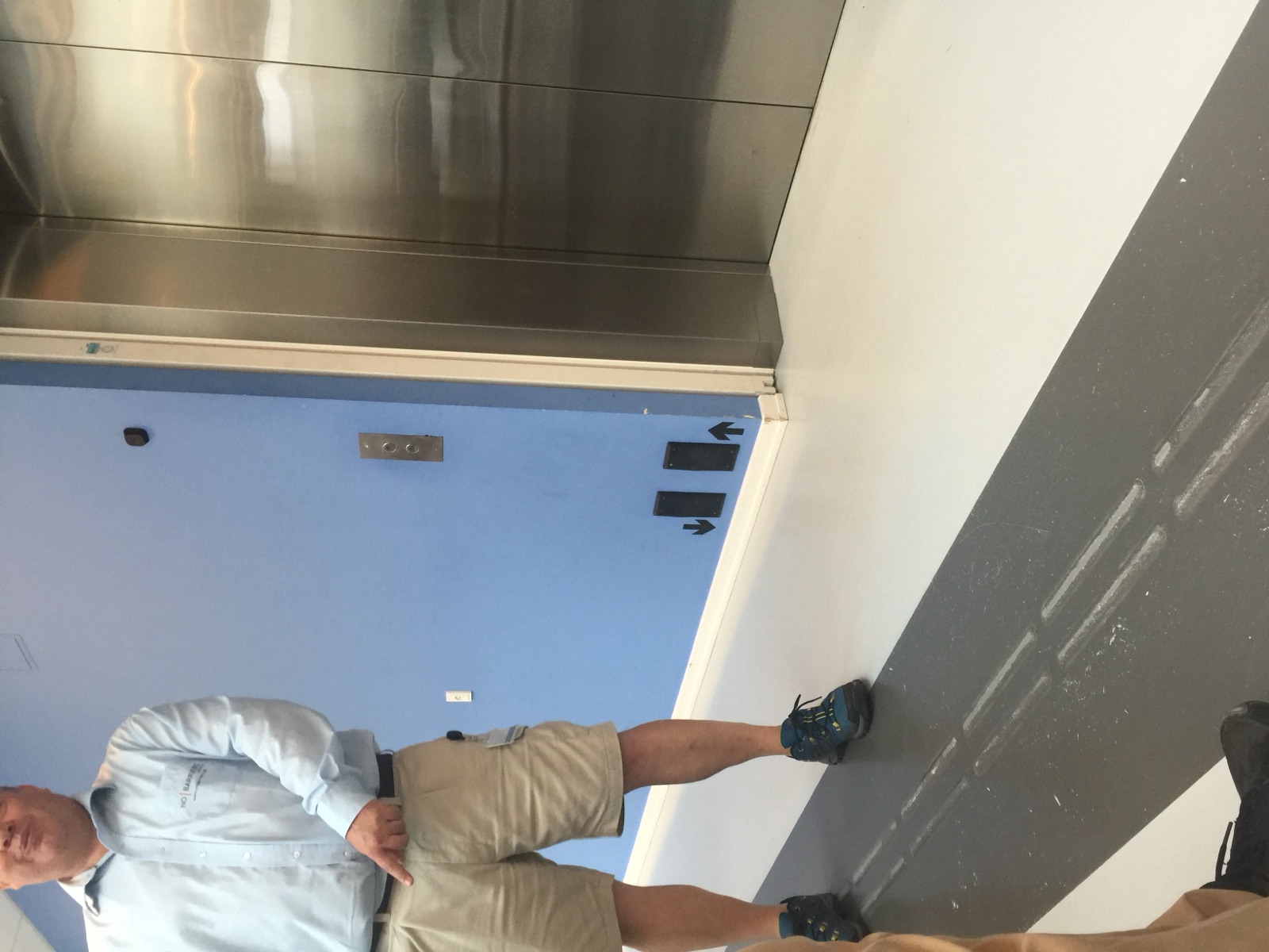
Elevator call buttons repeated at foot height beside the standard panel. Not a separate special panel: the same buttons, in one more place. One of the staff demonstrated it for me, calling the lift with the toe of his shoe. For hands that do not reach, do not grip, or are simply full. This transfers to any building with an elevator. That is to say, any building.
The kitchen door button — Gothia Towers, Gothenburg
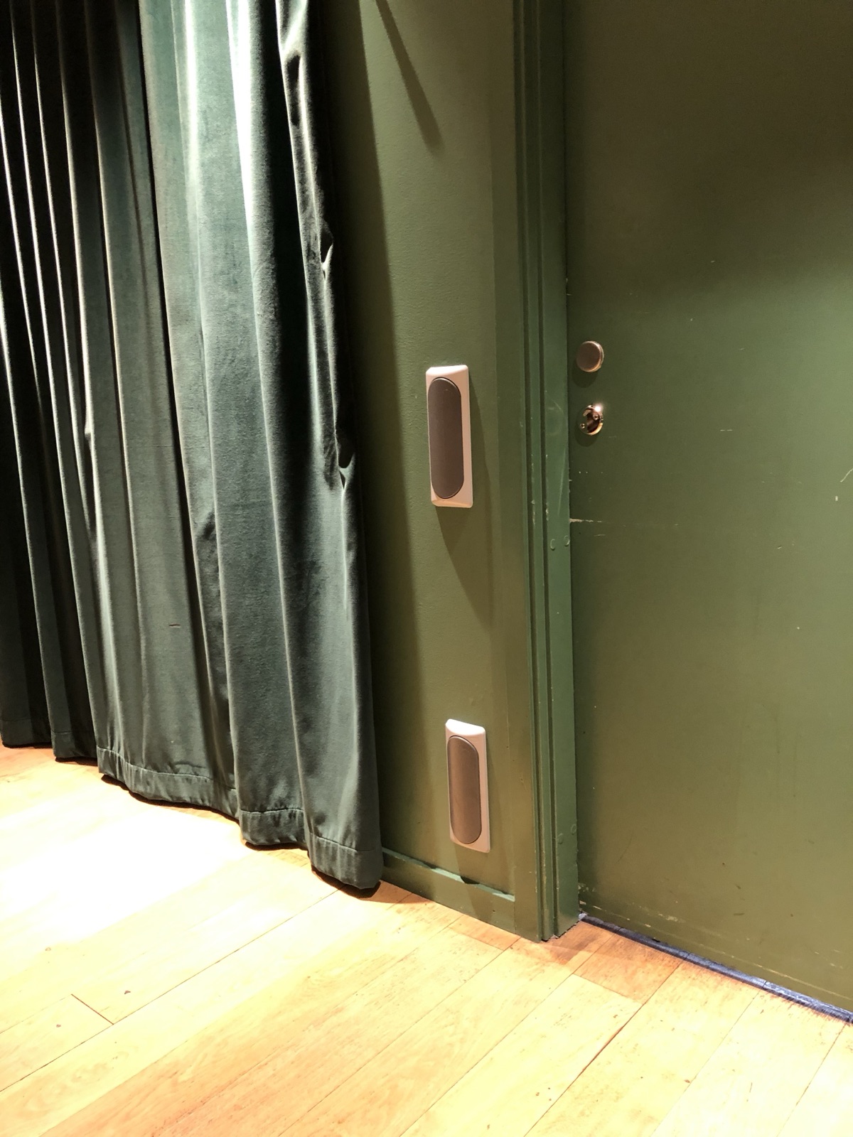
A green door on a green wall, into one of the restaurant kitchens. Beside the standard door-opening button at elbow height sits a second one at foot height. Here it was placed for the staff: when they come through with their hands full, they hit it with a foot. In Taastrup the same solution serves a different situation, an electric wheelchair user who cannot reach the upper button. Two use cases, one solution. The button never asks which situation you are in.
Contributes to the shift from adaptism to variation. Repeating the whole function at another height answers differences in reach with more provision, not with a lesser version.
Offer more than one way
Design move
Offer what people need, in more than one form, and let it say nothing about who may need it.
What it resists: provision aimed at a category, the dispenser that exists only behind the “ladies” sign.
The RedLocker — IKDC restroom, Lund University
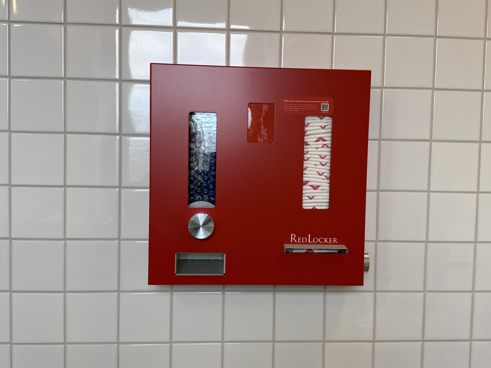
A bright red dispenser offering two products in two ways: tampons and pads, one behind a knob, one behind a slot. Free, visible, and placed in all the toilets, not only in one type of room. It says what it offers and nothing about who may need it. Menstruation is treated as a normal fact of life, not as a special case for one gender behind the “right” door.
Several ways to sign in — Swedish e-services
Public e-services in Sweden typically offer several routes into the same account: mobile BankID, another e-identification, sometimes a code sent by post. The routes sit side by side on the same login page, and none of them is marked as the special one. The provision says what it offers and nothing about who may need it. Whoever cannot or will not use one route takes another, and nobody has to ask for the adapted version.
Contributes to the shift from adaptism to variation. Provision offered everywhere, in more than one form, meets the variation before anyone has to ask for the adapted version.
Many ways, one outcome
Design move
We spend most of our attention on how to get somewhere. The outcome is what matters: where everyone ends up, and whether they end up there together. Hold the outcome constant and the ways can multiply freely. Steps, ramp and rail become equals, because each one arrives at the same place.
What it resists: ways that arrive at different outcomes for different bodies. The side door, the back entrance, the route that gets you there late and alone.
The atrium ensemble — Mittuniversitetet
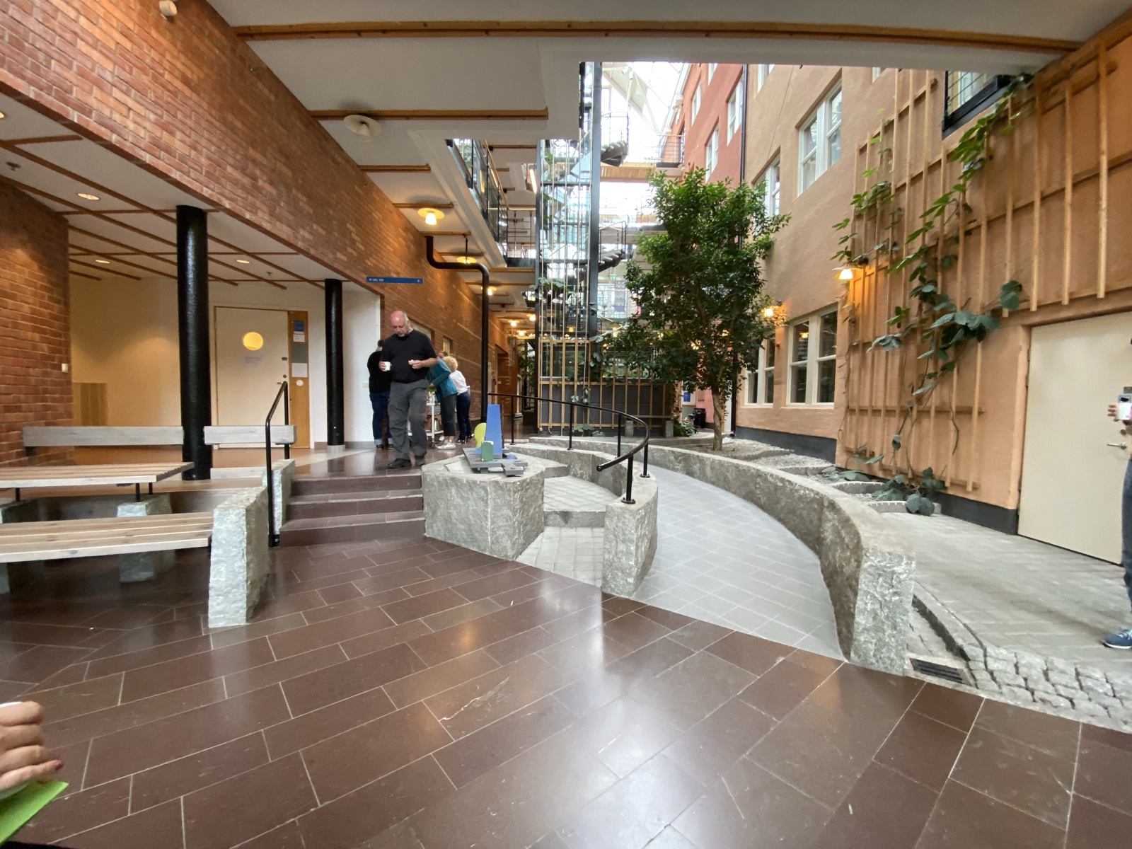
An indoor courtyard where the level change is handled by central steps and a broad curved ramp built together as one ensemble. It is not tidy, several materials meet, and it still works: the composition offers several ways to manage the height difference, and every one of them ends on the same floor, at the same tables. The ways differ. The outcome does not. Kin to Offer more than one way: that move says plurality. This one holds the endpoint.
Captions, transcript and sound — the same talk
A recorded talk reaches you as sound, as captions, and as a transcript. Watch it muted on the train, listen while driving, read it at your own pace, search it afterwards. The ways differ. The talk is the same talk, and everyone arrives at the same content. Digital material multiplies ways at almost no cost, so the outcome can hold still while the routes keep multiplying.
Contributes to the shift from separation to convergence. When the outcome is shared, many ways do not harden into a hierarchy.
Let it be touched
Design move
Place the artwork where hands can reach it, in material that welcomes touch, with no plinth height or barrier keeping bodies at viewing distance. Art that can be known through the hands does not need to define its audience.
What it resists: the rope, the raised plinth, the do-not-touch sign. Art that presupposes sight and distance.
The tactile site model — L’Almoina, Valencia
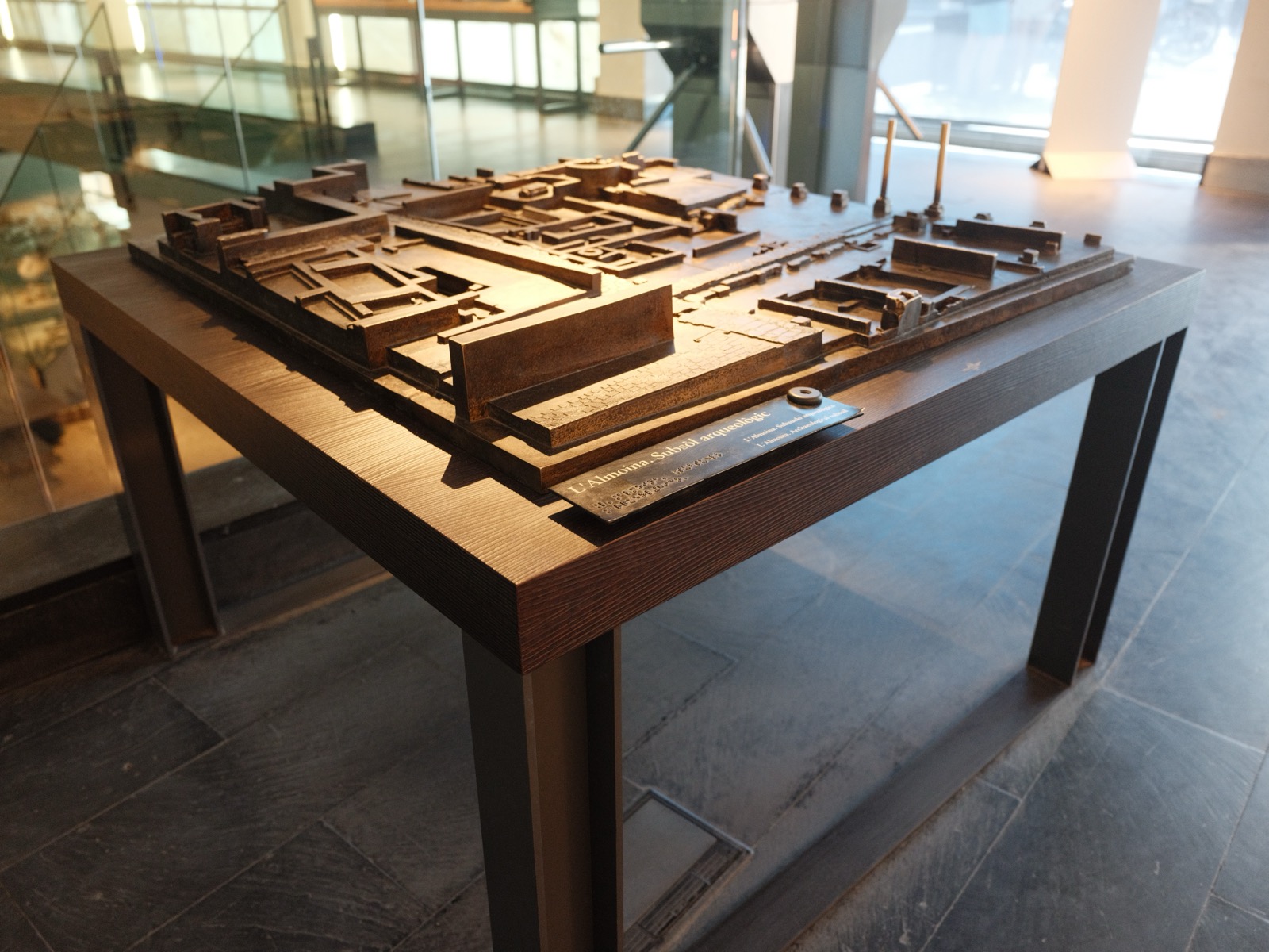
A bronze model of the archaeological site, on an open table with no case and no barrier, its label in raised letters and braille. Made to be read by hand: anyone can take in the excavation by touch — blind visitors, children, anyone curious. The model is not marked as being for anyone in particular. It is simply one more way to know the place.
The bird in the hand — Ave Quiromántica, Málaga
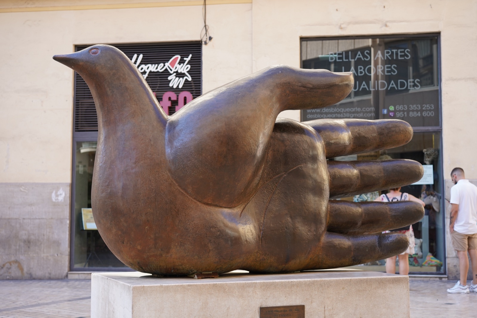
A bronze bird and an open hand fused into one body, on a low plinth in a pedestrian street, polished by years of touching. The work also rewards a moving body: from one side it is only a hand. Walk around it and the hand becomes a bird. What the sculpture is depends on where you stand, and the join between hand and feathers is easier to feel than to see.
Contributes to the shift from included to undefined users. The work asks nothing about the body that approaches it.
Transform, don’t separate
Design move
Let one design change shape instead of splitting people onto different routes. When the thing itself transforms, a separate path doesn’t need to exist.
What it resists: the caged platform lift bolted on beside the grand staircase, or the detour through the kitchen in the goods lift.
The staircase that is also the lift — protected historic building, Sweden
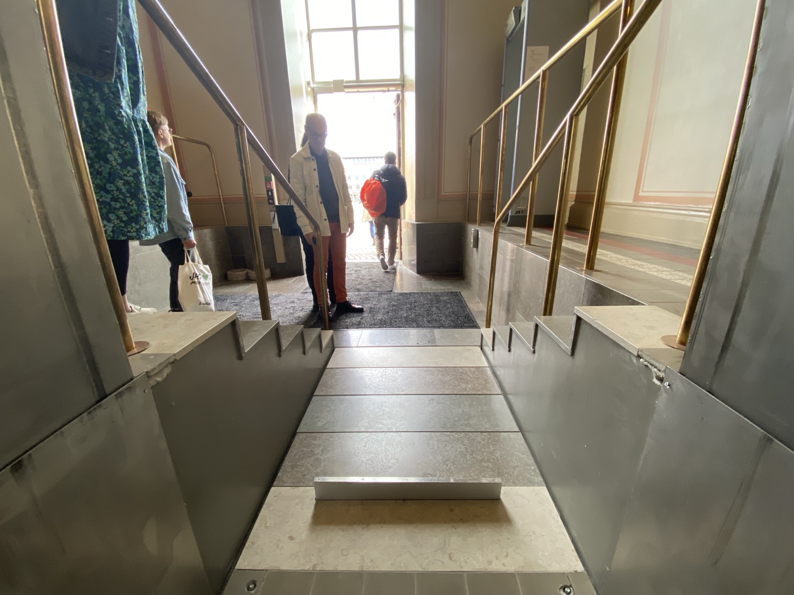
These steps fold into a flat platform, rise, and become steps again. Everyone uses the same entrance, along the same route. In a protected historic building, a separate route cannot be added, so the staircase itself transforms instead.
Contributes to the shift from separation to convergence. A design that changes shape keeps everyone on one route where a second route would have split them.
Leave the circle open
Design move · also under: Categorise the environment, not the body or the person
Where seating or gathering forms a closed shape, leave an opening. The gap is what lets whoever arrives join as part of the circle.
What it resists: the closed circle of benches, with a signed wheelchair space two metres away, facing in from the outside.
The open bench circle — shopping mall, Sweden
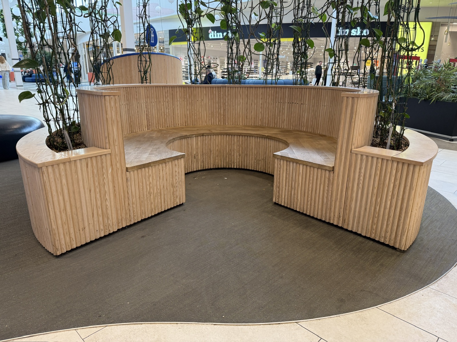
A curved bench that could have closed its circle, and didn’t. The opening lets someone in a wheelchair, with a stroller, or a walker join the seating as part of the circle, not parked at its edge.
Contributes to the shift from separation to convergence. An opening in the circle turns a parking spot at the edge or outside a closed shape into a place in the circle.
Dimension for togetherness
Design move · also under: Categorise the environment, not the body or the person
Give shared space the room that lets people stay together. Width and turning space are what make walking side by side possible.
What it resists: the corridor built to the minimum legal width, where a group must walk in single file. It follows the rules, and it is lonely.
The corridor that simply works — IKDC, Lund University
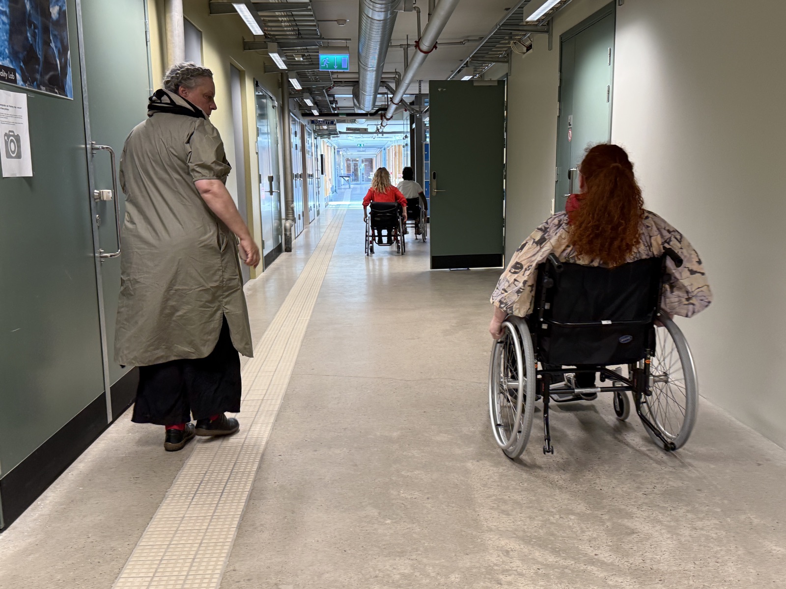
Five of us, one walking, three in wheelchairs, and me behind the camera, moving as one conversation during a walkshop I ran. Nobody waits, nobody is sent another way, nobody drops into a single lane. The corridor is not “accessible”. It is simply wide.
SAMMENBÆNK — the together-bench, Denmark
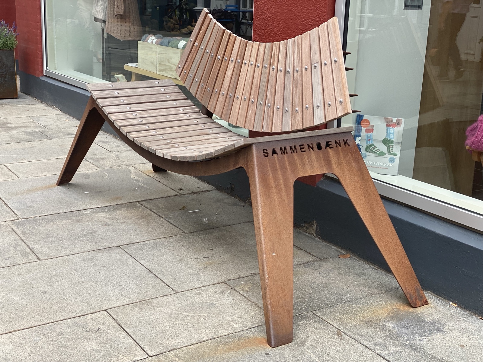
A public bench that states its move in its own name: sammen, together. The seat is a shallow curve with the lowest point in the middle, so sitters drift gently toward each other instead of parking at opposite ends. The togetherness is in the geometry: the curve brings people closer.
Contributes to the shift from separation to convergence. Generous dimensions let people who move differently stay in the same conversation.
One route for everyone, built with pride
Design move · also under: Categorise the environment, not the body or the person
Build the generous route as the main route, and let everyone take it. Pride in the making is part of the move: the route is the architecture, not the workaround.
What it resists: the “accessible route” arrow pointing the long way round the back.
The ramp everyone takes — paseo at Postiguet beach, Alicante
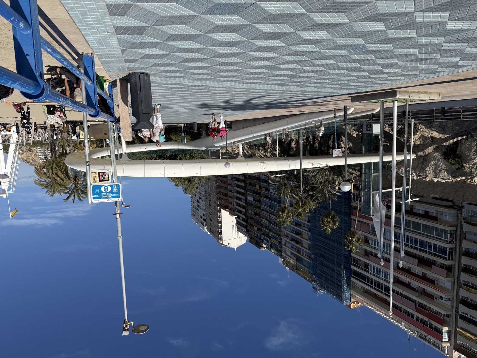
A sculptural white ramp that carries the whole flow of the paseo between two levels. Those who might have taken stairs and those for whom the ramp is the only way travel the same generous curve. The ramp is not the accessible alternative to the architecture. It is the architecture.
The ramp that is the building — Musholm Ferie- og Sportscenter, Denmark
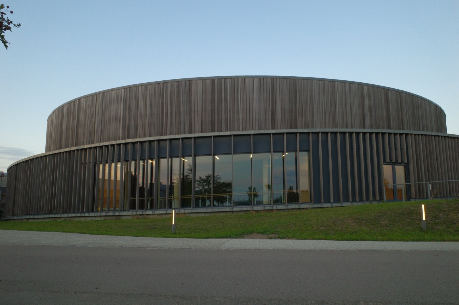
A circular timber-clad sports hall where the level changes are handled by a long curved ramp that runs along the inside of the round gymnasium. From outside you see the slopes but no ramp, because the ramp is not an accessory bolted onto the building. It is the building’s own way of moving people. The same move as the Alicante paseo, carried out at the scale of a whole house.
Contributes to the shift from separation to convergence. When the generous route is the main route, the separate route is not needed.
Where these come from
The moves on this page are grounded in published research and in my own field photography. If you want to dig deeper, here is what each work carries:
-
Hedvall, Price, Keller & Ericsson (2022): Towards 3rd Generation Universal Design – Exploring Nonclusive Design
The paper where nonclusive design is defined, and where accessibility that needs no visible markers is described as having become simply how the world is. The theoretical root of the moves on this page.
-
Hedvall & Ericsson (2024): From Inclusive to Nonclusive Design – A Shift in Categorisation
The chapter this guideline’s phrase comes from: a shift in categorisation makes it possible to meet variation with variation. Its worked example is the bench that meets human variation with seating variation.
-
Hedvall (2007): Situerad Design för Alla – till improvisationens lov (licentiate thesis, in Swedish)
The earliest form of this guideline’s argument, seventeen years before the phrase: designing for many possibilities is a way to avoid costly and stigmatising special solutions for particular groups of people.
The full publication list is on the CV page. More on the How-to page.