Categorise the environment, not the body or the person
We need categories to live. A lamp must be a lamp, and without categories we would lose our minds. The argument is not against categorisation but about its object. Rooms, environments, functions, mechanisms, sizes, and equipment can be sorted and labelled freely. Bodies, persons, and roles cannot, without cost.
These are places to begin designing from, not standards to audit against. Every example below exists, photographed or quoted as I found it. Each move names a design act or a text act, something you do as you build or write, which then often shows in the result.
Say what the room offers, not who it is for
Design move
Describe the room’s equipment, functions or layout instead of its users. For: anyone who needs what the room offers. The room addresses situations, not identities.
What it resists: the door that works like a sorting machine: a sign that makes you declare what category you belong to before you may use the room.
“Toilet with wall grip” — the Netherlands
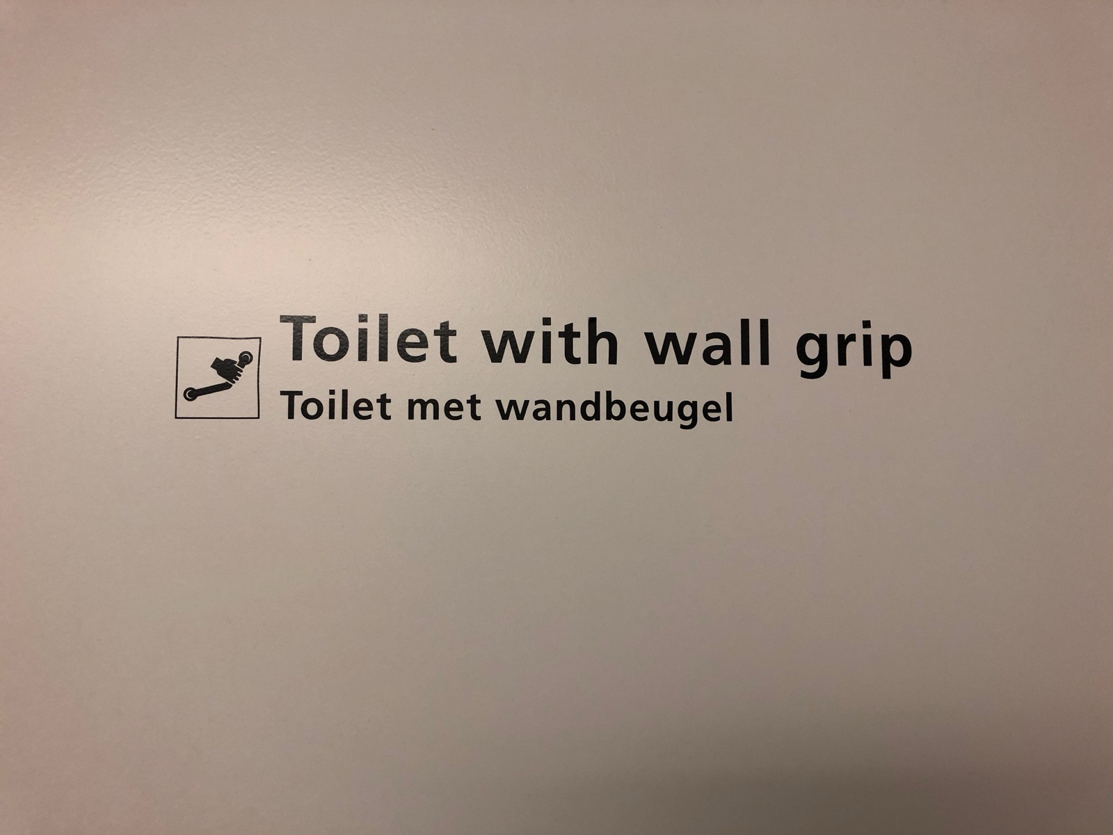
The sign says what the room contains: a toilet, a wall grip. Not “accessible toilet”, not “disabled toilet”, no wheelchair symbol sorting users at the door. Anyone who wants a grab rail, for any reason on any day, reads the sign and knows.
A toilet. A toilet with grab rails — Humanisten, Gothenburg University
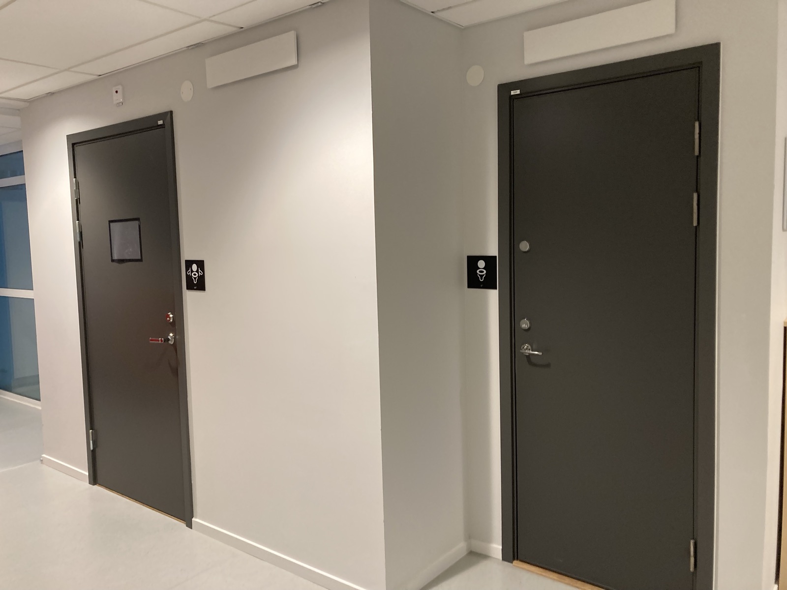
Two doors, two signs: a toilet, and a toilet with grab rails. You choose by what you need today, not by what category you have been assigned to. No person appears on either sign.
Contributes to the shift from person to function. Every door that states its equipment, functions or layout instead of its user moves signage one step from person to function.
Show the mechanism, not the user
Design move
Where a control operates something, depict the function. The pictogram shows what the mechanism does, not who is supposed to press it.
What it resists: the blue button with a wheelchair symbol: a mechanism everyone uses, labelled as if it belonged to one group.
The door control that describes the door — interior doorway, Sweden
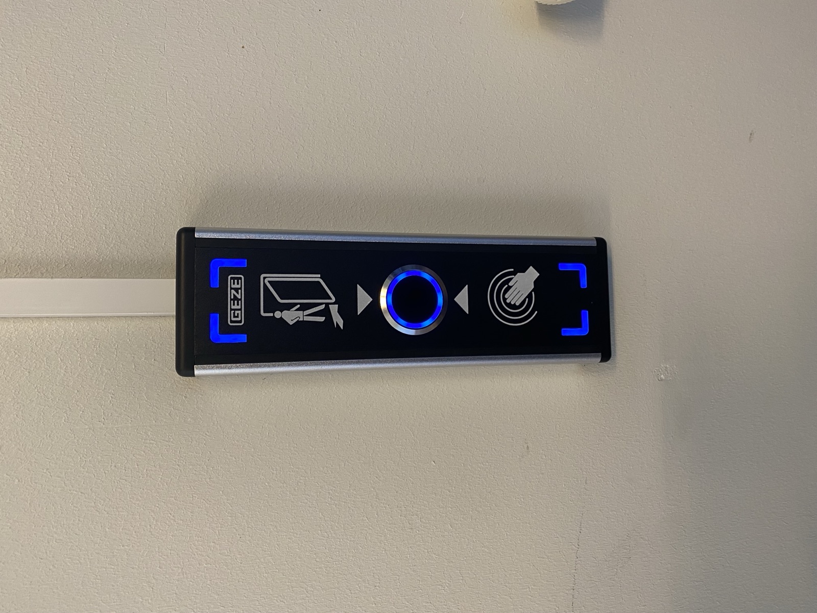
Every icon on this panel describes the mechanism: how the door swings, where it can catch you, that a wave of the hand opens it without touch. The user it assumes is anyone with something to wave. Compare the standard “accessible door” button, wheelchair-marked although everyone presses it: full hands, a pram, a coffee. Same function, opposite message.
The deck panel — outdoor deck, dark timber cladding
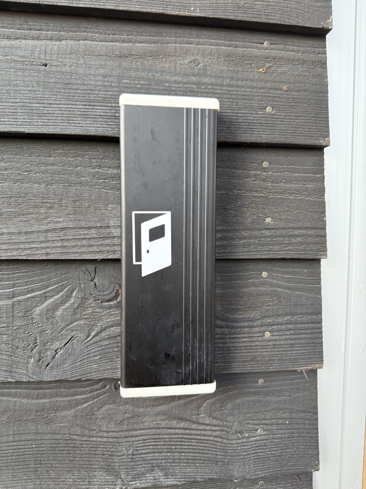
The same panel outdoors, weathered on black timber: the pictogram shows the door and its opening, not a person pressing. Indoors or outdoors, the design does not decide in advance whose hand, elbow, hip or bag will meet it.
Contributes to the shift from person to function. A control that depicts its own operation removes one categorising pictogram of a person from the built world.
Mark the size, not the body
Design move
Where dimensions differ, show the dimensions. Size is a property of the room, not a description of its users.
What it resists: the wide door with a wheelchair sign on it, as if width belonged to one type of body.
The wider and the narrower door — public restroom
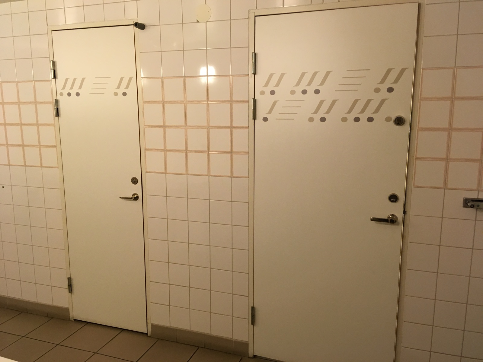
Two cubicle doors of clearly different widths, each decorated with a playful band of lines and dots. That is all the signage there is. You choose by what fits: today’s fit, with a wheelchair, a stroller, a suitcase, a restless child. The difference is about size, not about who you are.
The reserved parking bay — Växjö
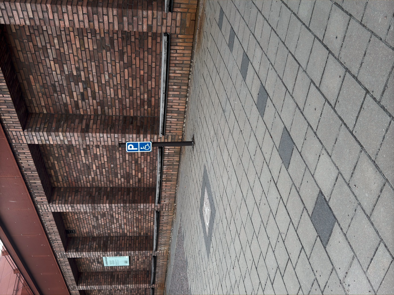
An accessible parking bay in Växjö, next to the entrance of a brick building. The bay is level and wide, and the wheelchair figure appears twice, on the sign post and inlaid in the paving. A reserved bay needs a mark, since someone has to be able to enforce the reservation. The mark can say what the bay is, reserved, wider, nearest the entrance, instead of whom it is for. That is the move I would propose here.
Contributes to the shift from adaptism to variation. When size belongs to the room instead of to a body type, different sizes are met by different rooms, and no one is labelled.
Address everyone, categorise no one
Design move
Speak to everyone at once, starting from the simple fact that people differ. Then nobody needs to be singled out or highlighted to be served.
What it resists: the well-meaning version that names a group in order to help it, and sorts everyone into different categories by doing it.
“WC” — Kalmar
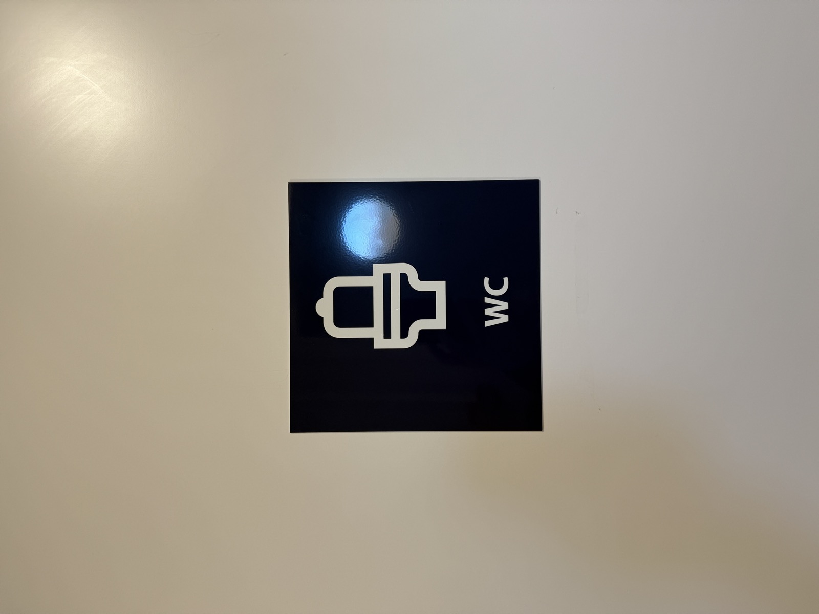
A dark blue sign: a toilet pictogram and the letters WC. Only what the room holds, nothing about who it is for. Kalmar municipality, one of the partner municipalities in our Syntax of Equality research project, had this family of signs produced during the project.
“Alla gillar olika” (Everyone likes different) — public interior, Sweden
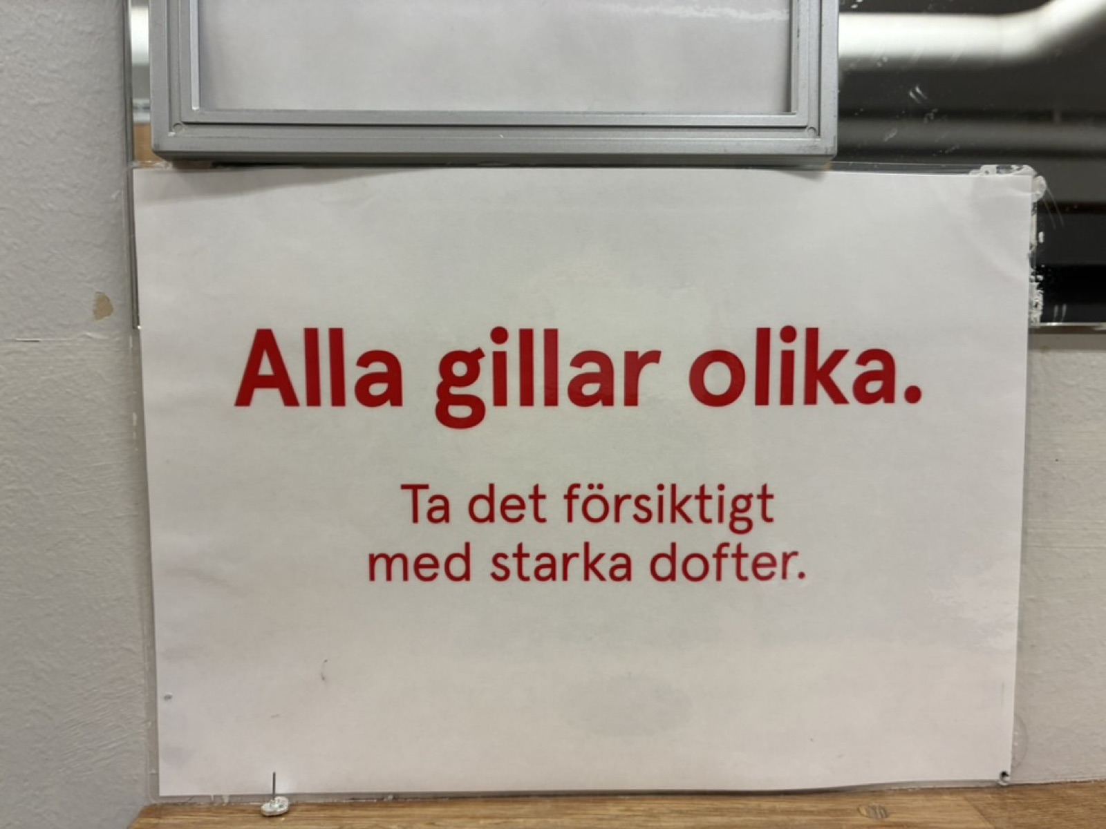
A sign about strong scents that starts from variation: everyone is different and likes different things. No condition is named, no icon, no group highlighted or asked to request access or raise their hand. Photo: Stina Ericsson.
Contributes to the shift from included to undefined users. A sign that starts from variation speaks to everyone without defining anyone, so nobody has to feel “included” as an afterthought.
State what applies to everyone
Text move
Where a text singles out one group for equal treatment, rewrite it so it speaks about everyone. The rewrite loses no information. It loses the division.
What it resists: “on equal terms with others” — the norm group the sentence builds. Others being whom?
“All residents” — Swedish municipal policy text (rewritten in our Syntax of Equality project, translated from Swedish)
All residents can move around and use all indoor and outdoor environments in the city.
From singling out one group to stating what applies to everyone: one single, shared us. The original said: “People with disabilities can move around and use all indoor and outdoor environments in the city on equal terms with others.”
“Everyone has the opportunity” — education policy (a published example)
Everyone has the opportunity to reach educational goals, irrespective of abilities.
The same move in the field of education, published in a peer-reviewed paper (Hedvall & Ericsson 2024): the group singled out for equal treatment becomes everyone, treated equally. The original said: “People with disability have the opportunity to reach educational goals on the same terms as others.” Two published examples of one move, in two policy areas.
Contributes to the shift from included to undefined users. Each sentence rewritten for everyone removes both the group that had to be included and the hidden norm group it was compared with, the includers.
Say nothing about who
Text move · also under: Design for situations
A deliberate form: no list of groups. The responsibility lands on the institution and the infrastructure, and everyone is covered precisely because no one is listed.
What it resists: the list of groups, which ends with the people who did not fit the list.
“Safe and equal” — Swedish municipal policy text (rewritten in our Syntax of Equality project, translated from Swedish)
The municipality shall ensure that footpaths, cycle paths, roads and public transport for journeys between home, work and school are safe and equal.
This is silent accessibility in language, the text version of Make the question not arise. The original said: “The conditions for getting to and from work and school safely should be the same for men, women, girls, boys and others.” That final “and others” shows why lists fail: a list ends with the people who did not fit it.
Contributes to the shift from included to undefined users. The sentence with no list is the far end of the shift: no users are named at all. It also feeds the shift from explicit to tacit.
Reserve it for everyone
Design move
Take the language of privilege, words like reserved and VIP, and turn it around so that it now speaks to everyone.
What it resists: “reserved for disabled users”, the seat that must be claimed by category.
“Reserved for all” — public interior
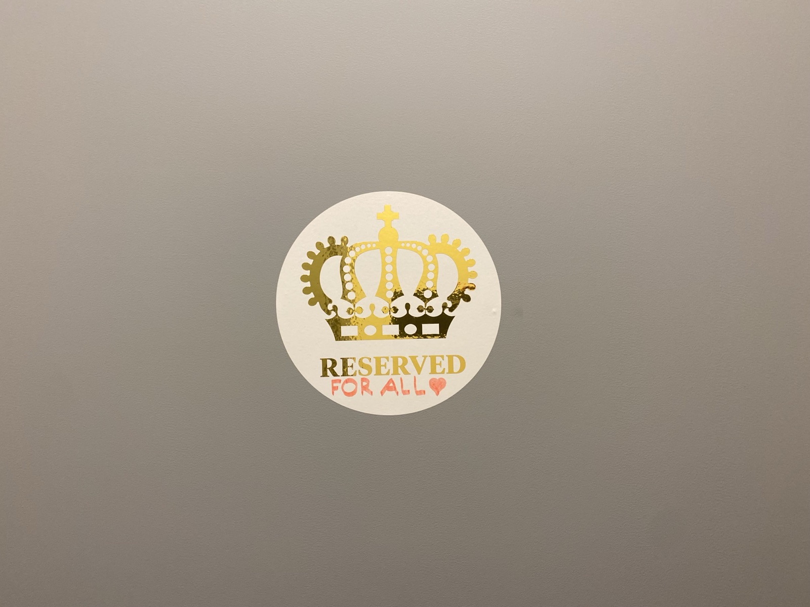
A round sticker with a gold crown and the printed word RESERVED. Someone has completed it by hand, in red: FOR ALL, with a heart. The word reserved normally means not for you. Here everyone is the VIP, and the crown belongs to whoever arrives.
Contributes to the shift from included to undefined users. When the word reserved is turned to address everyone, the language of privilege stops sorting people.
Decide whether to categorise people at all
Text move
Before writing a group into a sentence, ask whether the sentence needs a group at all. Often the goal itself carries everyone without naming anyone.
What it resists: adding “for people with impairments” out of habit, into goals that already cover everyone.
“Full participation” — the national goal of Swedish disability policy, government bill 2016/17:188
…to achieve equality of living conditions and full participation for persons with disabilities in a society based on diversity.
The national goal names the group. Now remove “for persons with disabilities” and read it again: equality of living conditions and full participation, in a society based on diversity. The sentence loses no information, and what it promises now belongs to the whole society instead of being a favour to one group. Gender-equality policy usually writes this way: its goal is seldom stated as “equality for women and men”.
The signup form — digital services everywhere
A signup form categorises, one field at a time. Each field asks something about who you are, and the move works the same way on a screen as in a policy text: for each field, ask whether the service needs the answer. Age matters when the law says it does. Gender rarely matters at all. A field nothing downstream needs is a category collected for its own sake. Deleting the field is the digital version of removing the group from the sentence.
Contributes to the shift from included to undefined users. Asking whether the sentence needs a group at all turns the shift into a writing habit.
Belonging assumed, not marked or postponed
Design move · also under: Meet variation with variation
Build as if everyone is already here. When belonging is assumed from the start, nothing special needs to be added, no conditions need to be met, and no sign needs to say so.
What it resists: access as an added layer. The rail added afterwards, the marked door, accessibility that apologises for being there.
Handicaporganisationernes Hus — Taastrup, Copenhagen
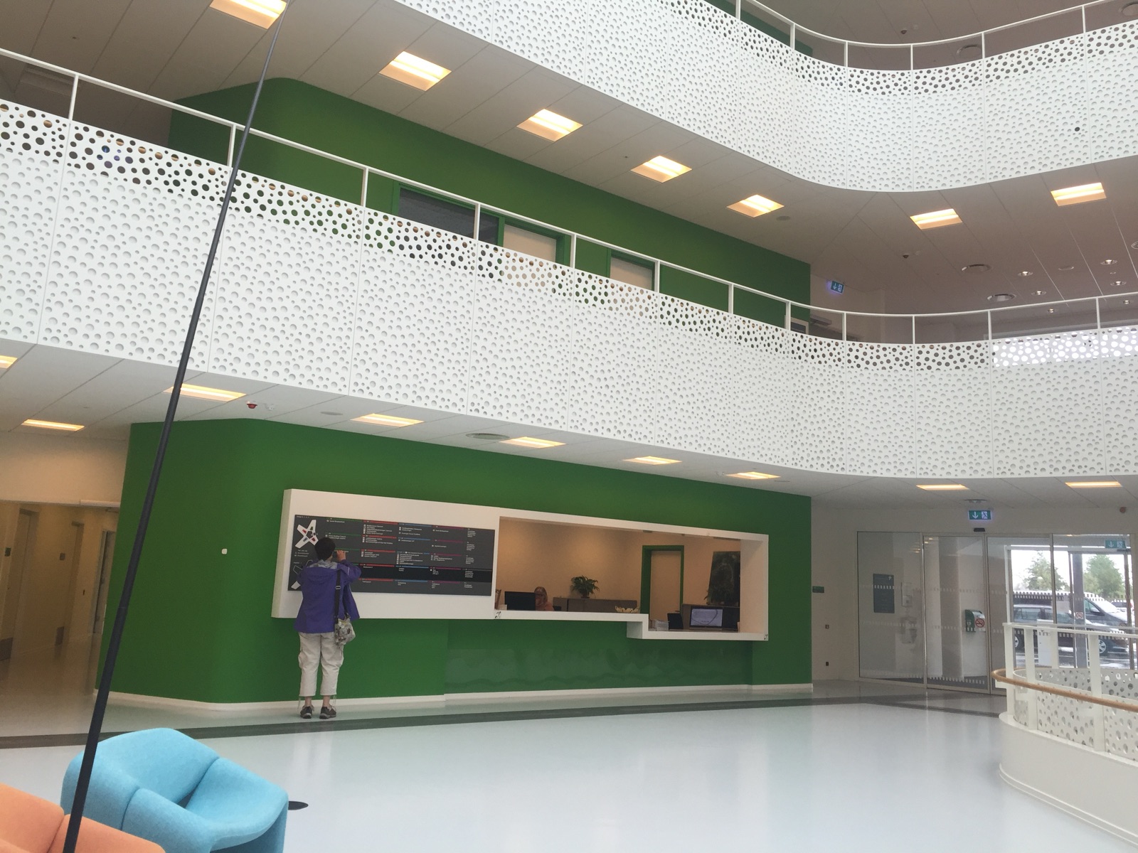
The house of the Danish disability organisations. The balcony panels are full of small holes that soften the sound, so people can hear each other in a large shared space. The green panels help you find your way by colour, without signs. Guide paths on the floor, carefully planned lighting, a central hall that works for several senses at once. And indoors there are no wheelchair signs. The thinking runs down to the smallest detail: the elevator buttons repeat at foot height (Equal at every height).
One interface, no separate version — the web
The web used to offer a separate accessible version behind its own link: the marked entrance, built in HTML. The link has mostly disappeared, and what replaced it is this move. One interface that already works with a screen reader, with a keyboard, with enlarged text. When the single interface carries everyone, belonging was assumed when it was built, not postponed to a parallel version that is usually a release behind.
Contributes to the shift from reactive to proactive. A house that assumes everyone from the first drawing doesn’t postpone access in waiting for a particular person to arrive.
Stock the aid as ordinary goods
Design move
Sometimes we need something extra as support. That is no reason to mark it as special. Put the cane where the hats are, price it the same way, and let it be bought the way everything else is bought.
What it resists: the medical aisle. The aid as equipment issued to a category of person rather than a thing a person picks up.
The cane rack among the hats — street market, Costa del Sol
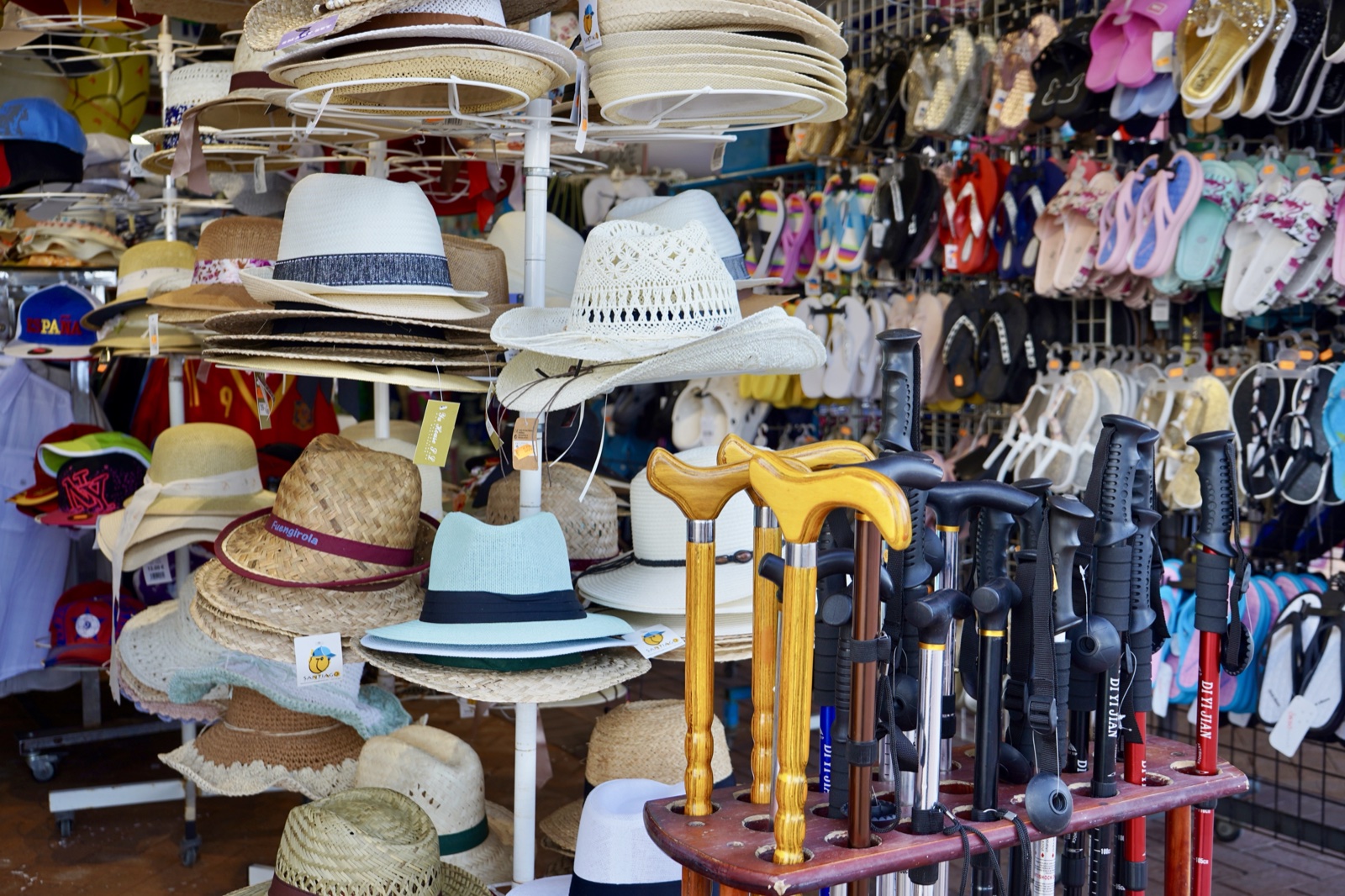
A market stall: straw hats on rotating racks, walls of flip-flops, and a wooden stand where walking canes with derby handles stand interleaved with trekking poles. Nothing frames the canes as medical. They are merchandise for whoever wants one. Canes and sport poles stand side by side, and nothing separates the one kind from the other.
Contributes to the shift from adaptism to variation. When the aid is stocked as ordinary goods, needing one stops being an exception.
Where these come from
The moves on this page are grounded in published research and in my own field photography. If you want to dig deeper, here is what each work carries:
-
Hedvall, Price, Keller & Ericsson (2022): Towards 3rd Generation Universal Design – Exploring Nonclusive Design
The paper where nonclusive design is defined: design that resists categorisations of bodies and roles, without predefined limits on whom it is meant for. The argument about the object of categorisation starts here.
-
Hedvall, Johansson & Ericsson (2022): Moving Beyond Human Bodies on Display – Signs of a Shift in Categorisation
Reads accessibility signage as categorisation at work: what it does when signs put human bodies on display, and what signs of a shift look like. The closest companion to the sign examples on this page.
-
Ericsson & Hedvall (2024): Situation, Non-Categorisation and Variation – Conveying Nonclusion Through Text and Image
Develops Situation, Non-Categorisation and Variation as guiding concepts, with examples of how a text or an image can describe the environment instead of sorting its users.
-
Ericsson, Wojahn, Sandström & Hedvall (2020): Language that Supports Sustainable Development – How to Write about People in Universal Design Policy (open access)
Examines how policy texts write about people and gives seven concrete recommendations. The place to go if the categorising you want to undo lives in documents rather than on doors.
-
Hedvall & Ericsson (2024): From Inclusive to Nonclusive Design – A Shift in Categorisation
Traces the step from inclusive to nonclusive design as a shift in categorisation, including the move from “people with disability have the opportunity” to “everyone has the opportunity”.
-
Who Are All These “Others” In Policy Texts? — Nonclusive by Design #5 (2025)
The newsletter edition that walks through the “others” of policy texts in a ten-minute read. A lighter entry point than the papers, and free to share.
The full publication list is on the CV page. More on the How-to page.