Tacit vs. Explicit Accessibility
All too often, what is accessible is highlighted and marked with wheelchair symbols.
The signs are used routinely as part of the existing culture around accessibility. In some situations, they are necessary. However, there are hidden power structures at play, upholding images of norm and deviation.
I recently wrote about our stay at the ILUNION Malaga. Overall, it was a delightful experience that we all enjoyed. What stood out was what didn't stand out: the high level of accessibility, ready to be used when needed but otherwise waiting silently. Because of that, I was surprised the first time we visited the restaurant.
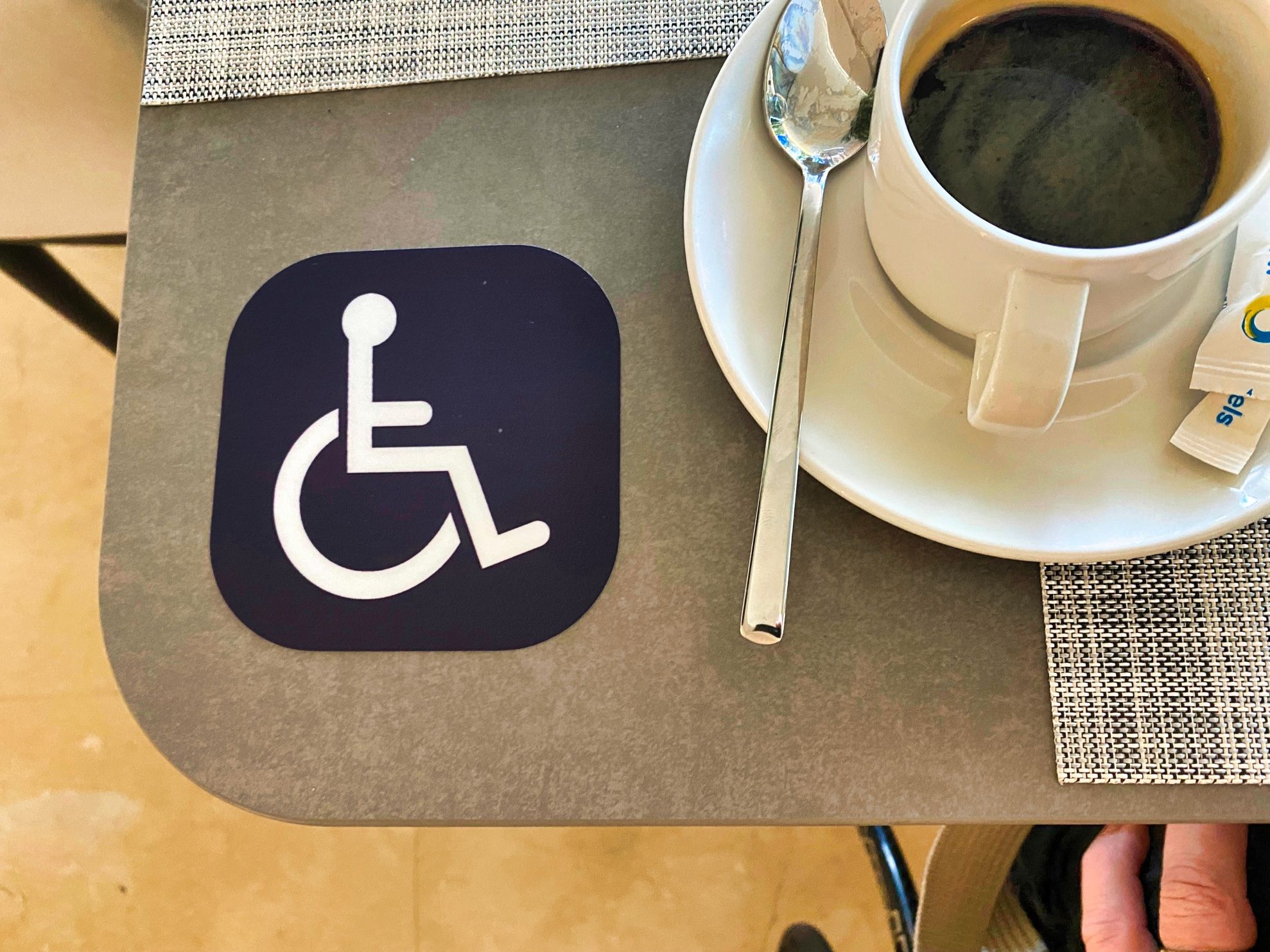
At breakfast, the staff assigned us a table with a sign of a person in a wheelchair (Picture 1). The table was placed quite near the breakfast stations. After looking around, I realised that most of the tables in the restaurant would not work that well for someone using a wheelchair. I guess that the inaccessibility of some of the tables created a situation where the hotel had to mark the accessible tables.
But, because of the tacit accessibility that otherwise characterised the hotel, the signs stood out in stark contrast. As a researcher in accessibility and Universal Design, I found the experience particularly memorable.
Looking ahead, we will need signs in certain situations, such as at the wide parking slots near entrances. But, as society becomes more and more accessible, how many signs can there be? Maybe silent preparedness for human variation is the future?
My colleagues and I recently wrote a paper on what we coined "Nonclusive design". I presented it at the UD2022 conference. In the paper, we outlined seven shifts in foci or seven shifts in design practice:
Nonclusive design means design that resists categorisations of bodies/roles and that does not come with predefined or presupposed limits in terms of who it is meant for. We have outlined seven themes characterising the shift towards nonclusive design. The concept directs attention to context instead of the individual, focusing on possibilities, functions and facilities. It has a convergent character, highlighting variation and unity rather than separation. Nonclusive design presupposes awareness, knowledge and proactive development void of adaptism. It incorporates human variation without reiterating patterns of norm-deviation. (Hedvall, et al., 2022)
In the silence reside openness, acknowledgement and recognition without predetermined limits regarding people, bodies, and roles. To achieve such a future, no doubt, will take just as much knowledge as today and the active involvement of persons with direct knowledge regarding what supports a society for all.
The ILUNION Malaga is only the second establishment I have encountered with such a high level of accessibility. The other one is the Danish Disability Organisations' office complex on the outskirts of Copenhagen, "The world's most accessible office building".
What characterises both of them? That the design processes were initiated and owned by disabled people's organisations. Interestingly, they are also similar in that you have to look hard to find a single sign with a wheelchair on it.
Is this the beginning of a pattern, and if so, what are the implications for the future? We currently explore this in the research project "The Syntax of Equality", funded by Vinnova, the Swedish innovation agency. More on that another time.

